Understanding the Hamburger Menu in ServiceNow: Small Icon, Big Purpose
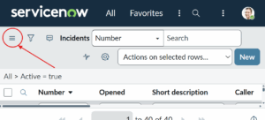
If you’ve spent any time working inside ServiceNow, you’ve likely noticed a small icon tucked neatly in the top-left corner – three stacked horizontal lines. That’s the hamburger menu. It’s simple, almost unnoticeable at first glance, yet it’s the door to everything you do on the platform.
Most users click it instinctively without thinking about what it represents, but behind that small symbol lies thoughtful design and purpose. In this post, let’s explore what the hamburger menu really is, why it matters, and how it helps make ServiceNow’s interface intuitive and clutter-free.

What the Hamburger Menu Really Is
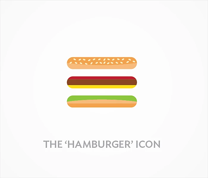
The hamburger menu isn’t some new fancy invention — it’s a design pattern that’s now universal in digital platforms. Those three lines symbolize a collapsible menu that neatly stores navigation options out of sight.
In ServiceNow, clicking on this icon opens the Application Navigator, which is essentially your central control panel. It’s where you access applications, workflows, reports, and every module relevant to your role. Think of it as a hidden dashboard that quietly keeps your workspace organized until you need it.
Why ServiceNow Uses the Hamburger Menu
ServiceNow isn’t a small app — it’s a vast enterprise platform that handles IT, HR, security, customer workflows, and more. With so many modules and features, the interface could easily become overwhelming.
That’s exactly why the hamburger menu exists. Instead of flooding the screen with tools and buttons, it keeps everything tucked behind one small, familiar icon. The result? A cleaner, faster, and more user-friendly environment.
It’s minimalism with meaning — a design choice that keeps the experience powerful yet effortless.
What’s Inside the Hamburger Menu
When you click the hamburger icon, it opens up the Application Navigator, which includes several essential sections:
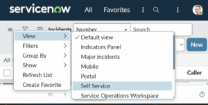
- Favorites – Quick access to your most-used modules.
- All Applications – A categorized list of every available app in your instance.
- History – A list of recently accessed records and modules.
- Filter Navigator – A search bar that instantly helps you locate what you need.
Each section is designed to save time and keep navigation smooth, even in complex ServiceNow setups.
The Power of Simplicity
What makes the hamburger menu so brilliant is its simplicity. Imagine if every single module, workflow, and report in ServiceNow appeared on screen at once — it would look chaotic.
By tucking these options away, ServiceNow lets users focus on what matters. When you need something, it’s just a click away — but when you don’t, it stays hidden.
That’s the balance that defines a great user experience: simplicity without sacrificing control.
How the Hamburger Menu Has Evolved
Back in earlier ServiceNow versions — like Fuji or Geneva — navigation looked bulkier and text-heavy. As the platform matured, ServiceNow designers started focusing more on modern UX principles, leading to a sleeker interface.
In newer releases such as Tokyo, Utah, and Washington, DC, the hamburger menu became more dynamic. It now adjusts automatically to your device — whether you’re using a large monitor, tablet, or mobile phone — so the experience stays consistent everywhere.
This evolution reflects ServiceNow’s commitment to making enterprise software feel as smooth as any consumer app.
Why the Hamburger Menu Matters for UX
From a UX (user experience) perspective, the hamburger menu solves a big challenge — how to pack hundreds of tools and functions into one clean, easy-to-use layout.
Here’s why it’s such a smart choice:
- Space Efficiency – Keeps your screen clean and organized.
- Consistency – Looks and works the same across all devices.
- Familiarity – The icon is instantly recognizable to most users.
- Focus – Reduces distraction so you can concentrate on the task at hand.
- Scalability – Handles more modules as your instance grows.
It’s one of those subtle features that quietly make the platform feel effortless to use.
In Agent Workspace
If you’ve used Agent Workspace, you already know how much navigation matters. Agents constantly jump between cases, reports, and dashboards — and even a few extra clicks can slow them down.
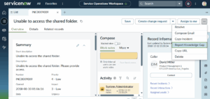
The hamburger-style menu here helps agents move swiftly without losing their place. It creates a consistent, focused workspace — one that lets them serve customers faster and with fewer interruptions.
The Debate Around Hamburger Menus
Some UX designers argue against hamburger icons, saying they hide too many features behind a single button. That’s true for some apps — but not for ServiceNow.
Given how much functionality this platform packs in, exposing everything at once would overwhelm users. The hamburger menu offers the perfect middle ground: accessibility without chaos. It’s a design compromise that enhances usability instead of limiting it.
The Future of Navigation in ServiceNow
As ServiceNow evolves, its navigation keeps improving, too. With updates like Polaris UX and Now Assist, the platform is embracing AI-driven and context-aware navigation.
In the future, users may see features such as:
- Predictive Navigation – Suggesting modules based on recent activity.
- Voice Commands – Allowing hands-free searches and actions.
- Adaptive Menus – Customizing the layout automatically for each role.
Still, the hamburger menu isn’t going anywhere. It’s become part of the platform’s DNA — a small but essential piece of the ServiceNow experience.
Final Thoughts
The hamburger menu in ServiceNow might look tiny, but it represents something much bigger — the idea that simplicity leads to efficiency. It bridges the gap between complex enterprise systems and clean, human-centered design.
It’s proof that a great user experience doesn’t always need to be flashy. Sometimes, it’s three quiet lines sitting neatly in the corner, making your workday a little smoother.

No comment